YOU ARE LEARNING:
Frequency and Tally Charts

Frequency and Tally Charts
Tally charts are a quick and easy way to keep count of something.
When running a questionnaire or survey to collect data, we must have an easy way to record data. We can't rely on memory to remember the favourite colours of 100 people in a survey!
Tally charts use vertical strokes for numbers
Each stroke represents . To make it easier to read, every fifth object is a diagonal stroke. Therefore, each group with a diagonal stroke represents
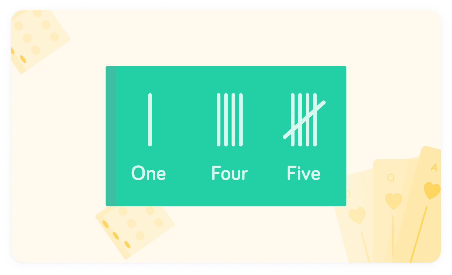
What does the tally represent?

The tally shows
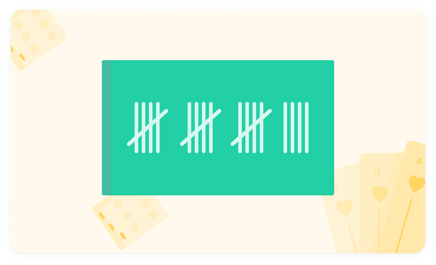
The first two groups represent each, while the two tallies after indicate a further . , so the tally represents
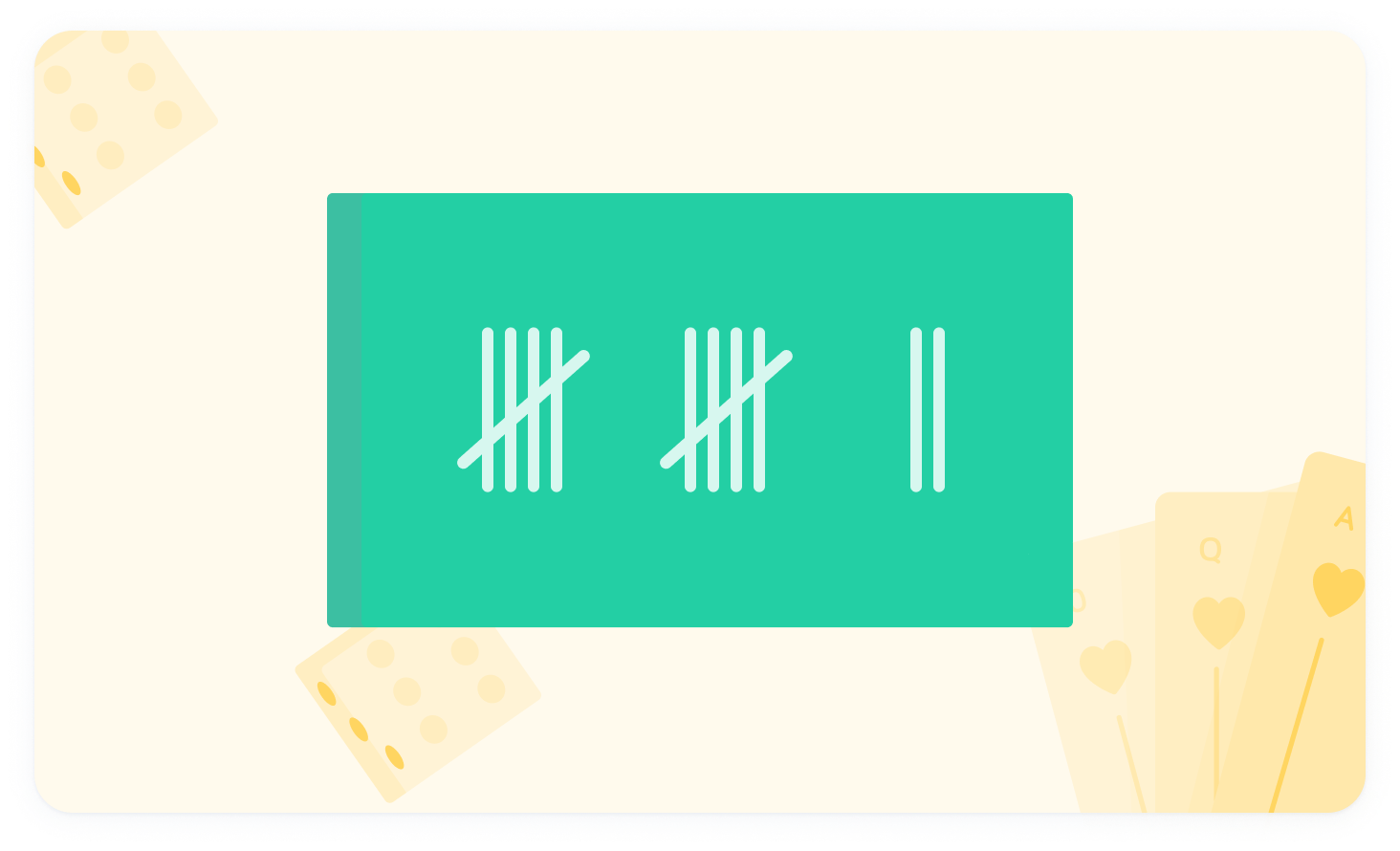
What does the tally represent?
Once we have used the tally count, it is useful to transform this into numbers, as this makes reading the frequency much easier. We can use a frequency table to display this.
This table shows a group's favourite colours
The tallies in the middle section are translated to numbers in the right-hand column, and represent the number of people with that favourite colour.
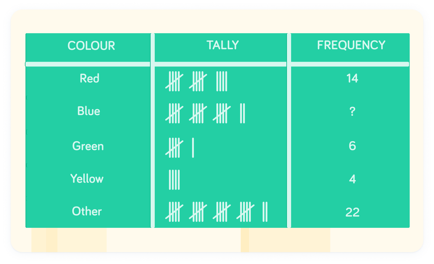
How many people said their favourite colour was blue?
Complete this sentence: Tallies come in groups of _____