YOU ARE LEARNING:
Frequency Polygons

Frequency Polygons
Frequency polygons are a method of visually representing frequency values for categories or intervals.
Another way to represent frequencies of groups and categories is by drawing frequency polygons. These can be used for both discrete and continuous data, and represent data in a very simple way.
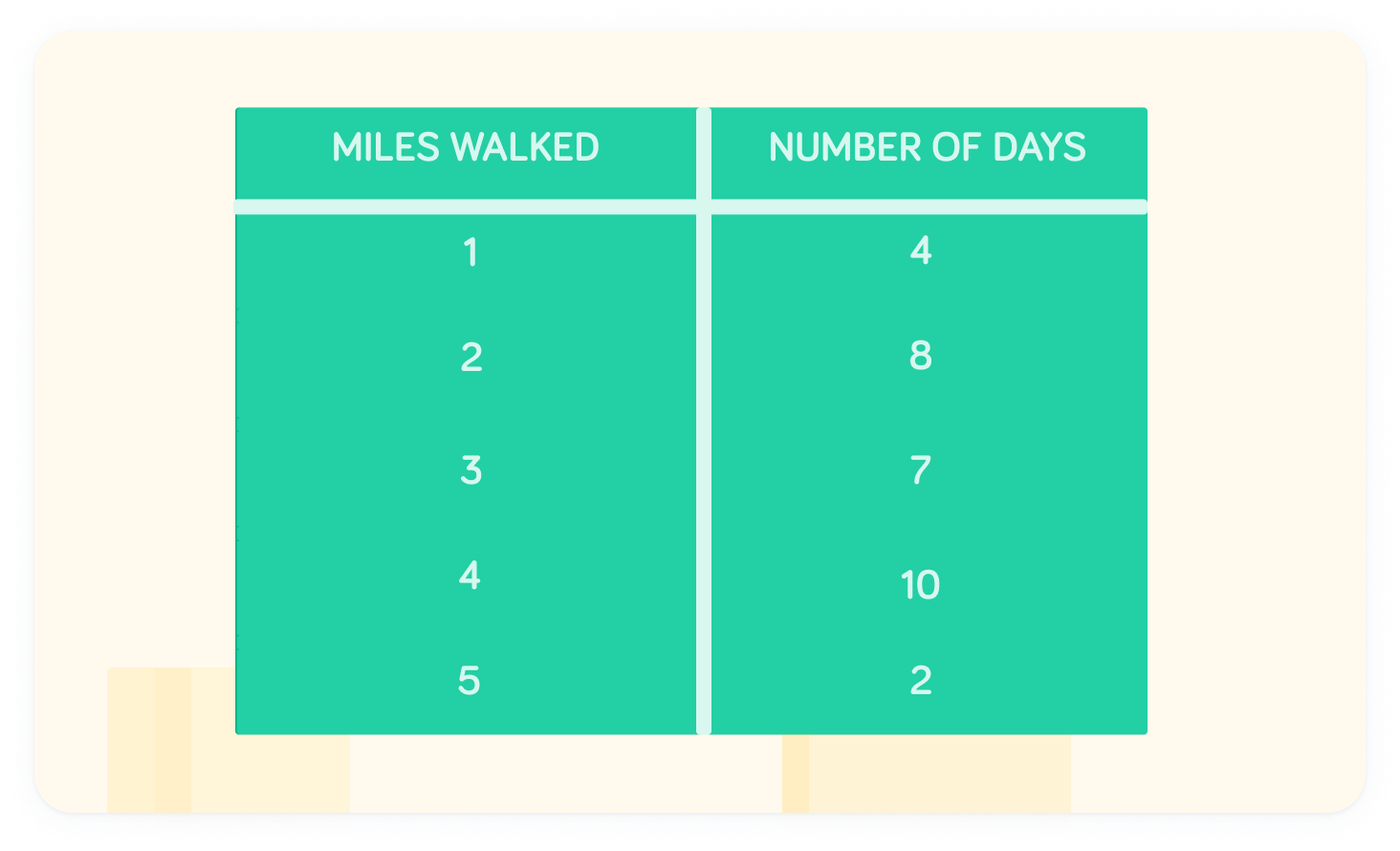
Zac records the number of miles he walks in a table
This is discrete data, which means we can easily translate this to a frequency polygon without much further effort. All we need to do is generate points.
Frequency belongs on the y-axis
Therefore, to find the coordinates, use the number of miles as the x-coordinate, and the frequency for the y-coordinate.
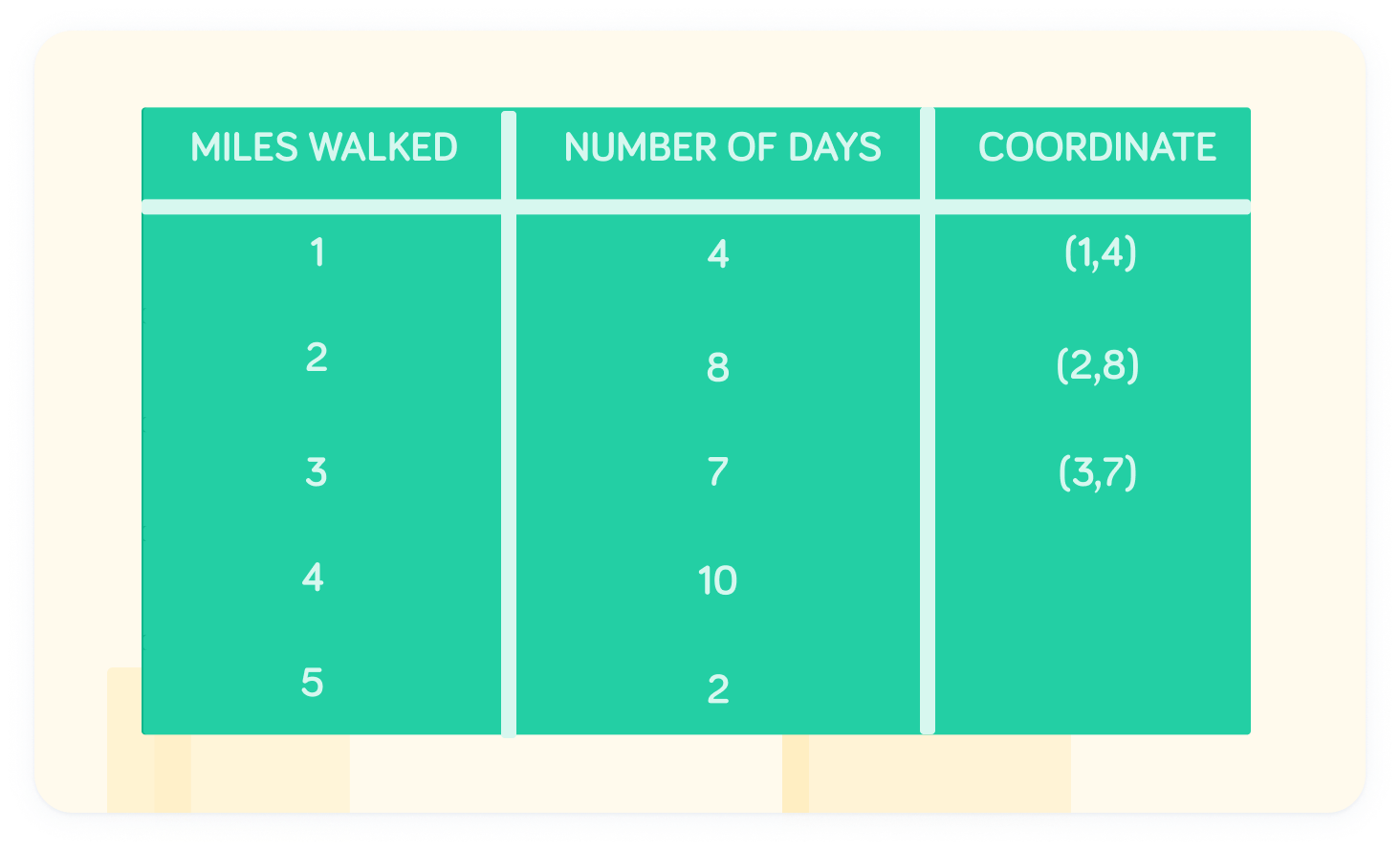
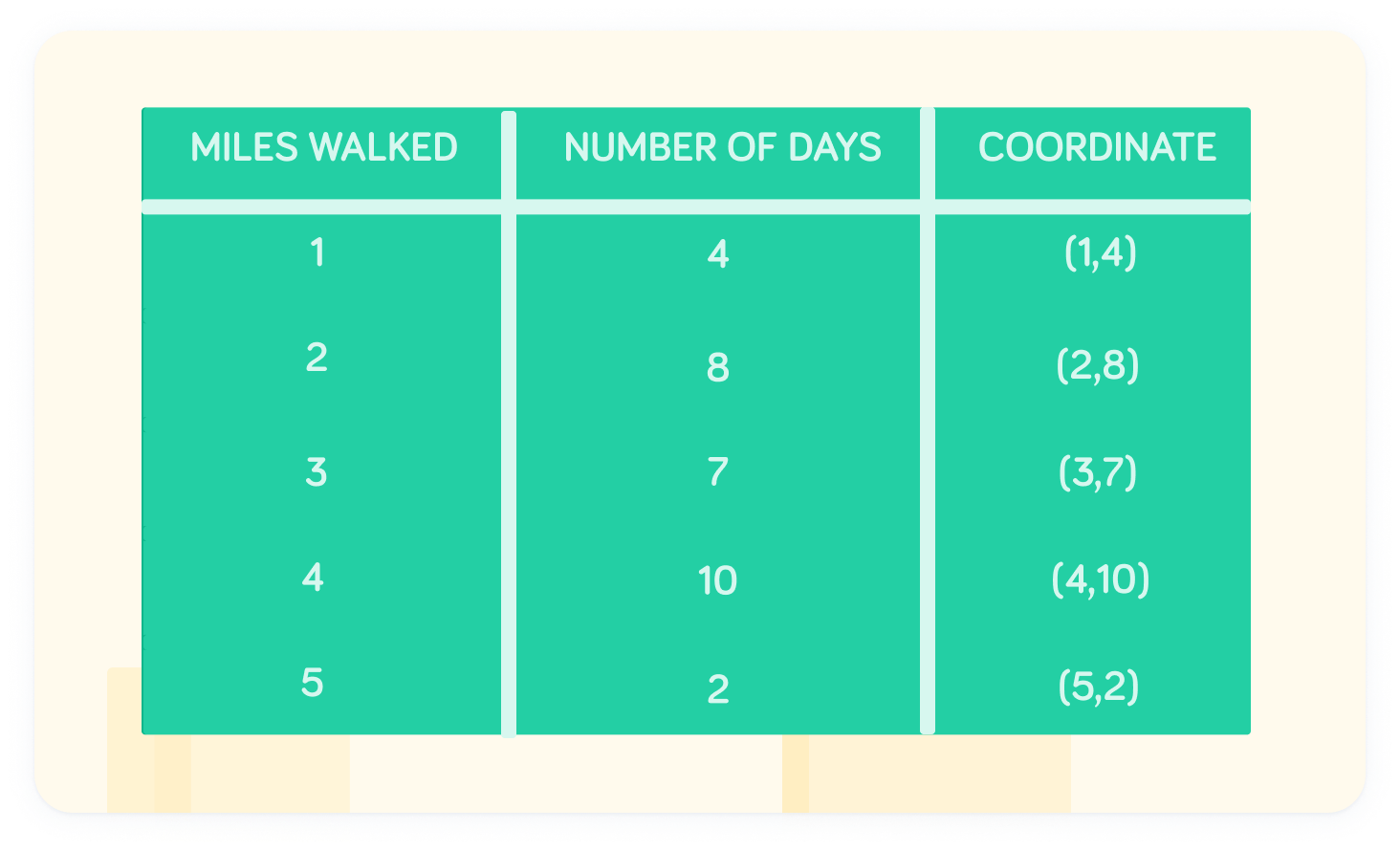
What are the coordinates for 4 miles walked?

What are the coordinates for 5 miles walked?

This the full set of coordinates
Now we can look to plot these on a frequency polygon!
We can also use a frequency polygon to represent continuous data.
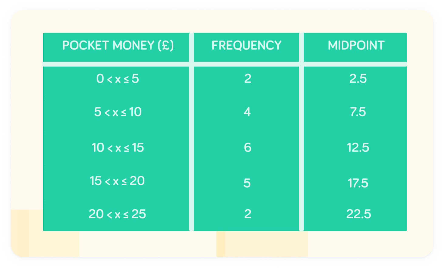
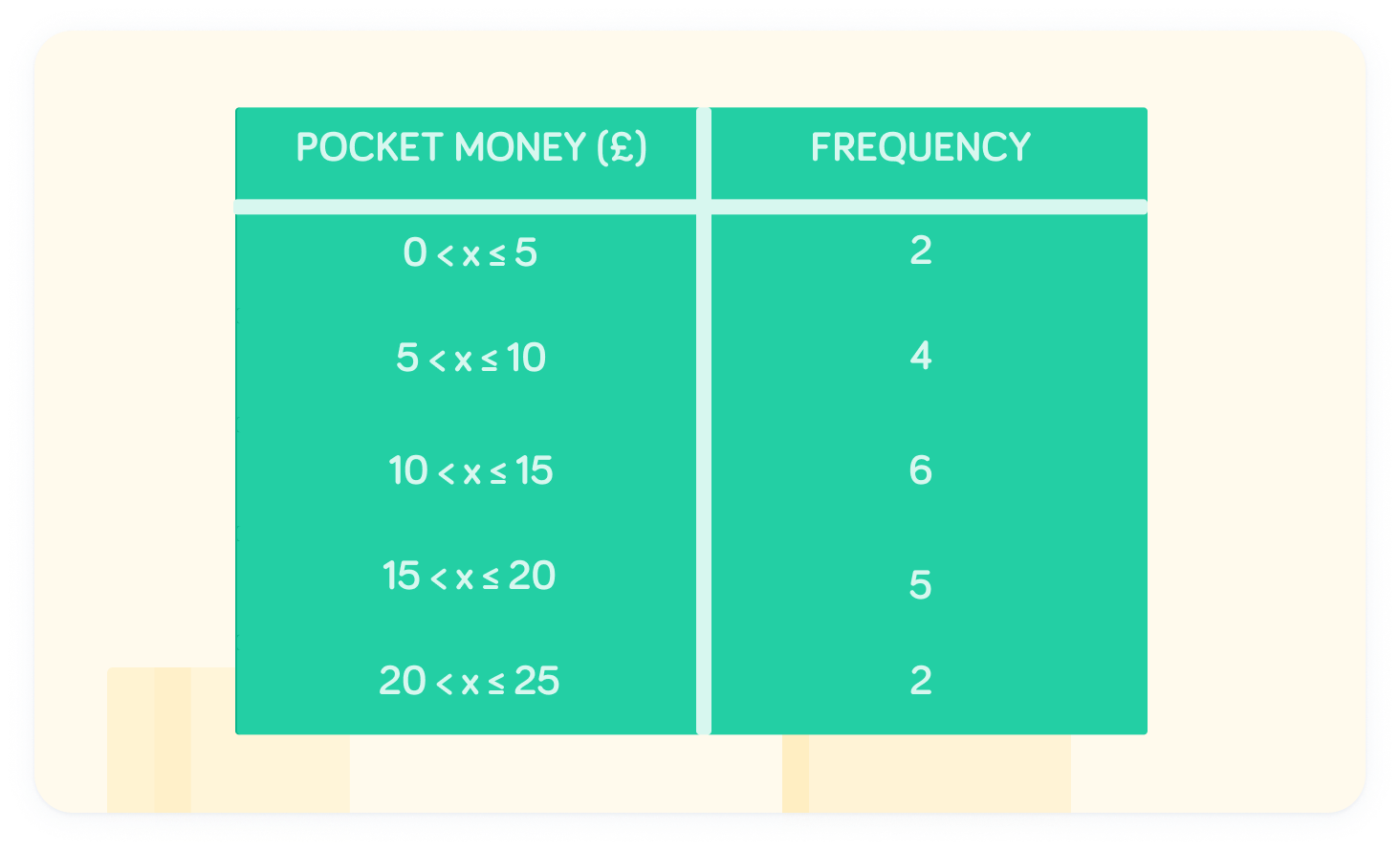
A class is asked about the amount of pocket money they receive each week
We can see the data is continuous. There are 2 students that receive an amount between £0 and £5, but we don't know exactly how much. This would therefore be hard to plot on a graph.
To plot this on a graph, use midpoints
Choose the midpoint of each interval. This gives the fairest estimate. For example, the midpoint of the interval is
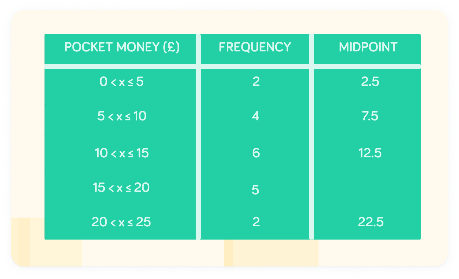
What is the midpoint of the interval ?
Now we have our coordinates
The midpoint value should be the x-coordinate, while the frequency should be the y-coordinate.