YOU ARE LEARNING:
Histograms

Histograms
A histogram plots data where grouped intervals are not equal in size.
When data is collected in grouped intervals, the intervals may not be equally sized. When plotted as a bar chart, the bars are therefore different sizes. This is called a histogram.
In a histogram, the area of each bar represents the frequency, and frequency is not plotted on the y-axis. Instead, we plot “frequency density” on the y-axis.
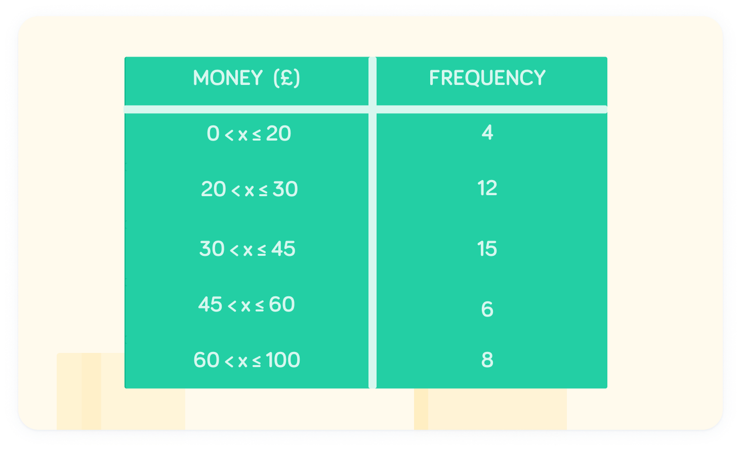
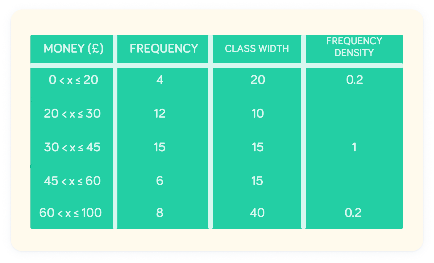
The table shows the amount of money spent by a group of people on a weekend
To draw a histogram, we need to add two additional columns: the class width and the frequency density.
The class width is the size of the interval
Notice that the class width is different for each interval.
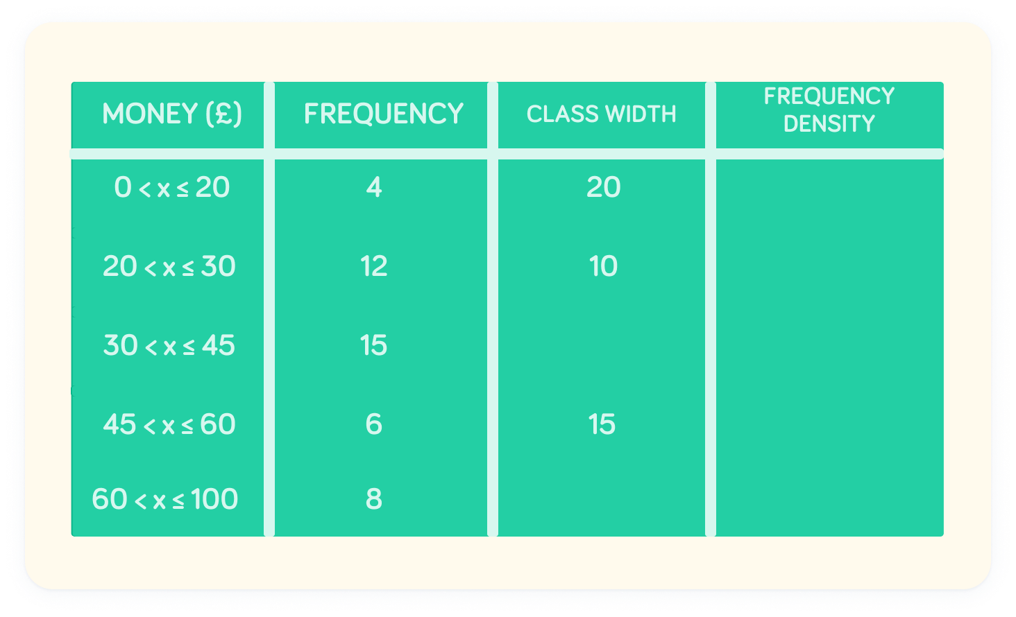
What is the class width of the interval ?

What is the class width of the interval ?
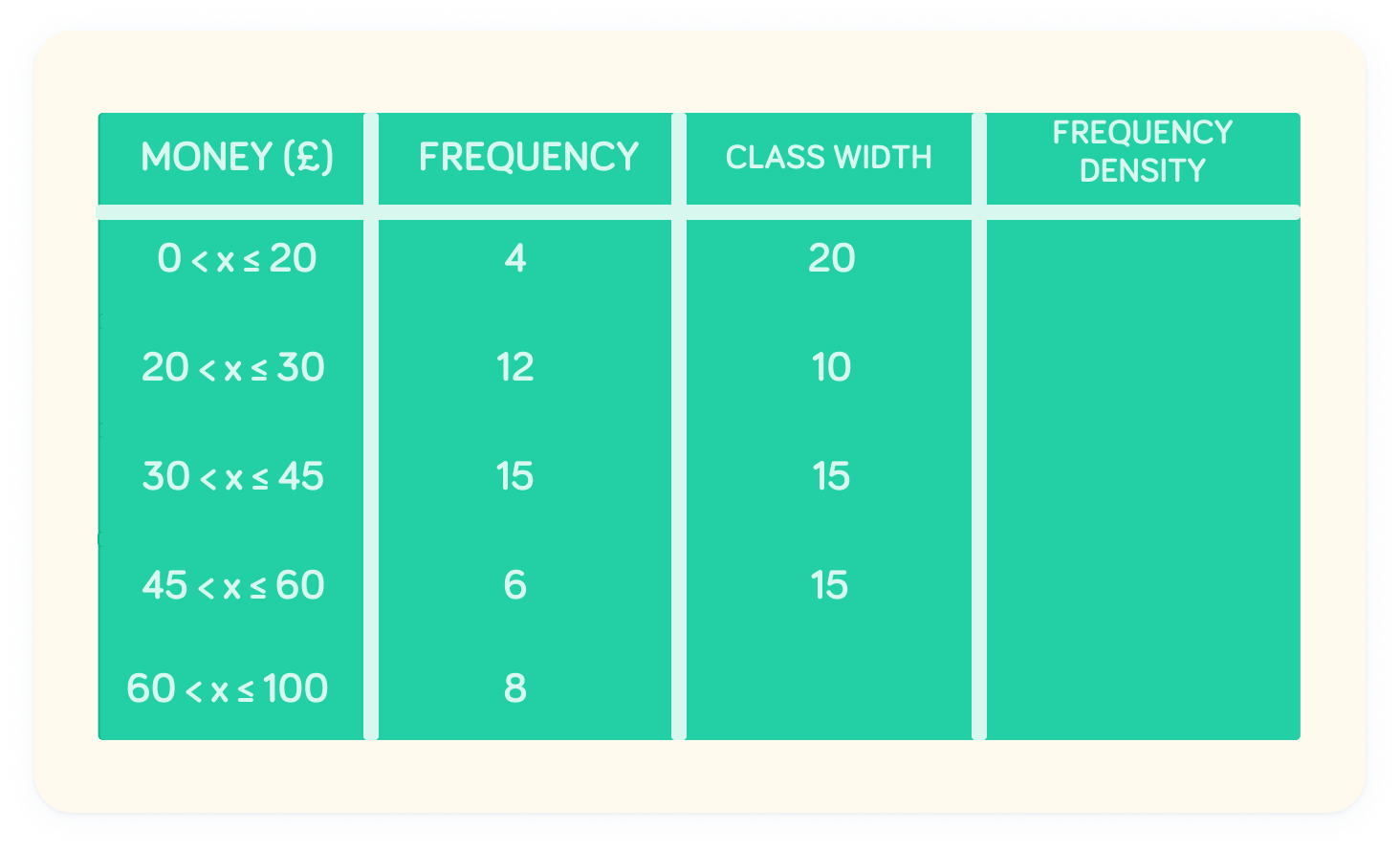
Now we can work out the frequency density
This is a measure of the area of the bar (like a bar chart). The formula for frequency density is given above.
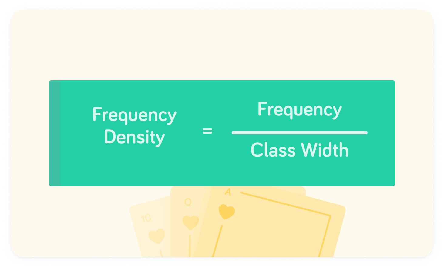
The frequency density measures the area
The frequency density for the interval is
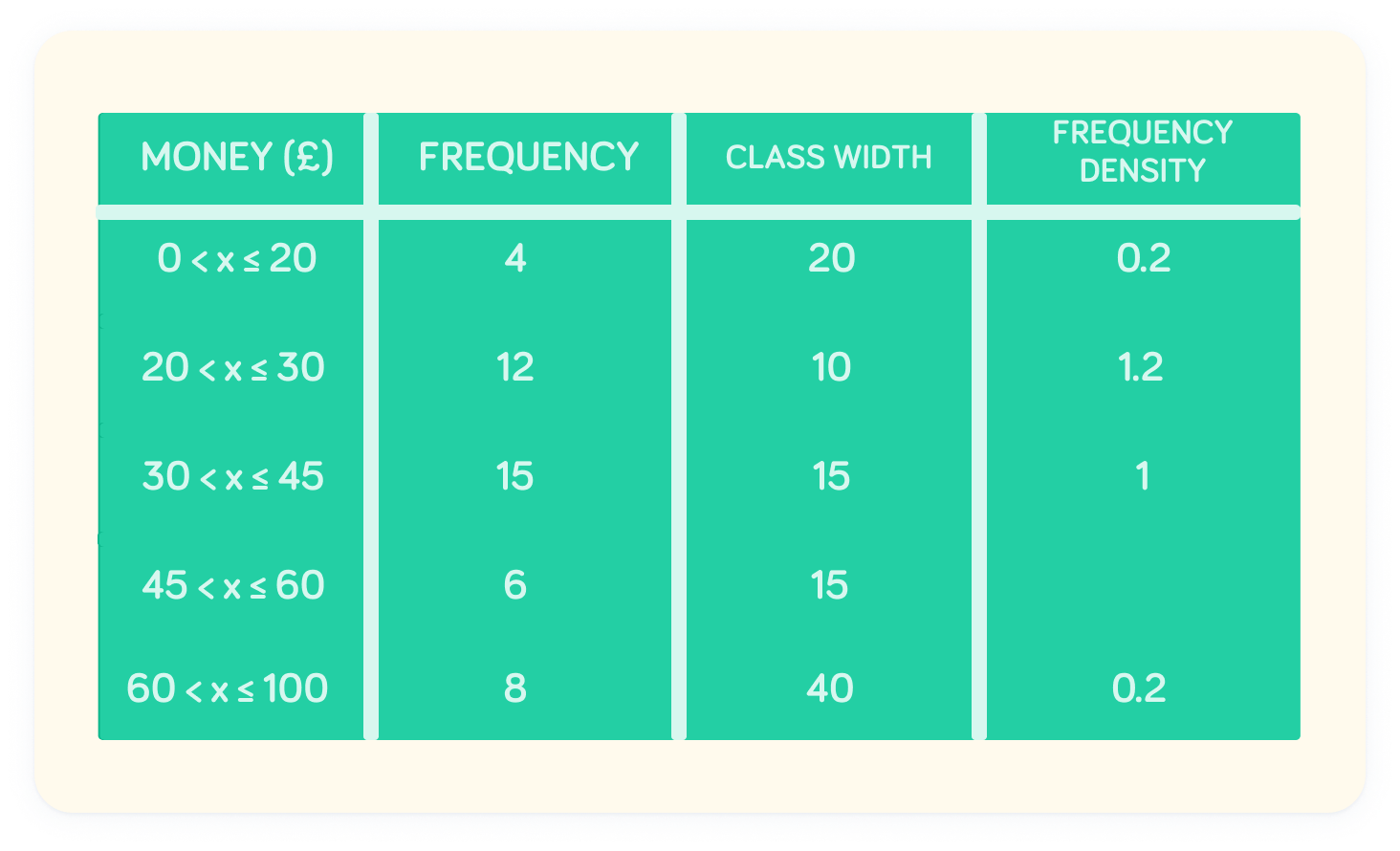
What is the frequency density at the interval ?
At , the frequency density is 1.2
What is the frequency density at the interval ?
At , the frequency density is 0.4
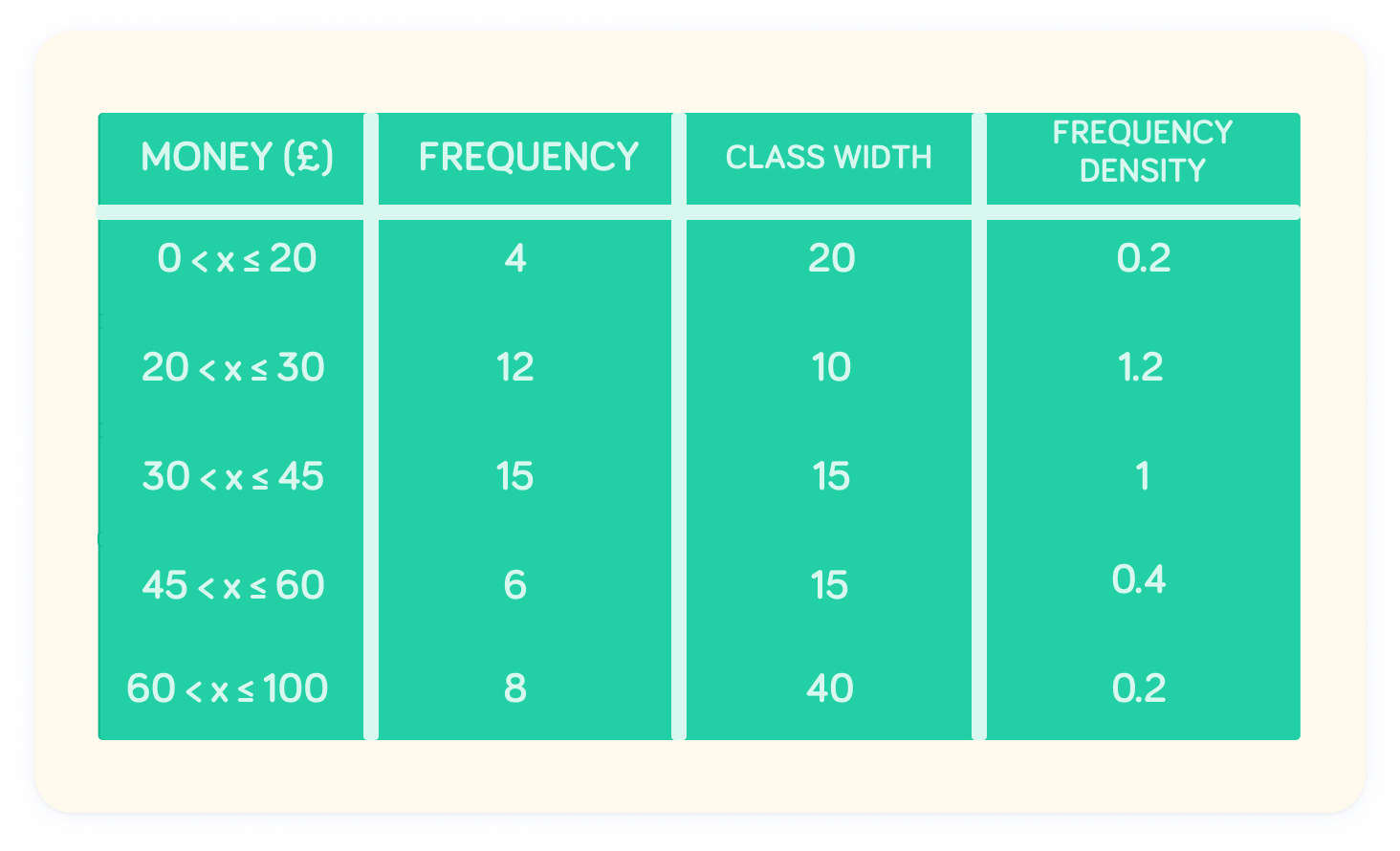
Nice!
Now we have the frequency density values, we can plot a histogram.