YOU ARE LEARNING:
Pie Charts

Pie Charts
Pie charts are a great visual way to display the relative proportions of quantitative data.
Pie charts are a nice visual way to display information about qualitative or discrete quantitative data, where the size of each part is proportional to the quantity it represents.
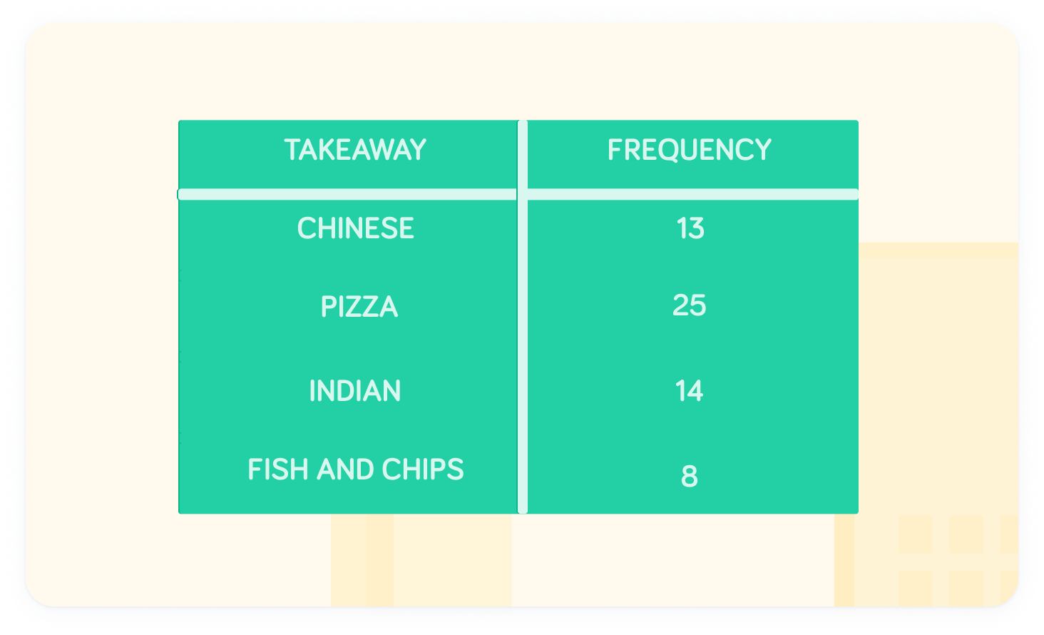
Let's imagine we ask 60 people about their favourite type of takeaway.
Each of the categories (types of takeaway) will occupy a single slice of the pie chart, where the size of the slice will be proportional to the frequency of people who picked each type of takeaway.
What do the angles in a circle add up to?

The angles in a circle add up to
Therefore, we can calculate the size of each section using the formula:
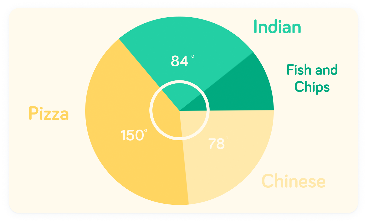
The sector angle for Chinese is
Chinese represents 13 of the total frequency of 60. Therefore, using the formula:
What is the sector angle for Indian?
The sector angle for Indian is
What is the sector angle for Fish and Chips?
The sector angle for Fish and Chips is
We can put these values into a pie chart
The angle of the sector from the centre controls the size. Therefore, since Pizza is the most popular choice, it has the largest slice of the pie.