YOU ARE LEARNING:
Scatter Diagrams

Scatter Diagrams
Scatter diagrams show the relationship between two variables, and can help us to identify whether there is any positive or negative correlation.
We commonly come across trends such as “the more hours you revise, the higher your score in an exam”. This claim comes from statistical analysis of the correlation between time spent revising and exam results. We can represent this data on a scatter diagram.
Correlation can be used to describe the relationship between two variables. For example, we may have temperature and the number of visits to a swimming pool.
When would you use a scatter diagram?

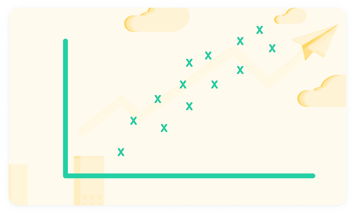
This is positive correlation
As one variable increases, so does the other variable. You can recognise this as the points follow an upward-climbing pattern.
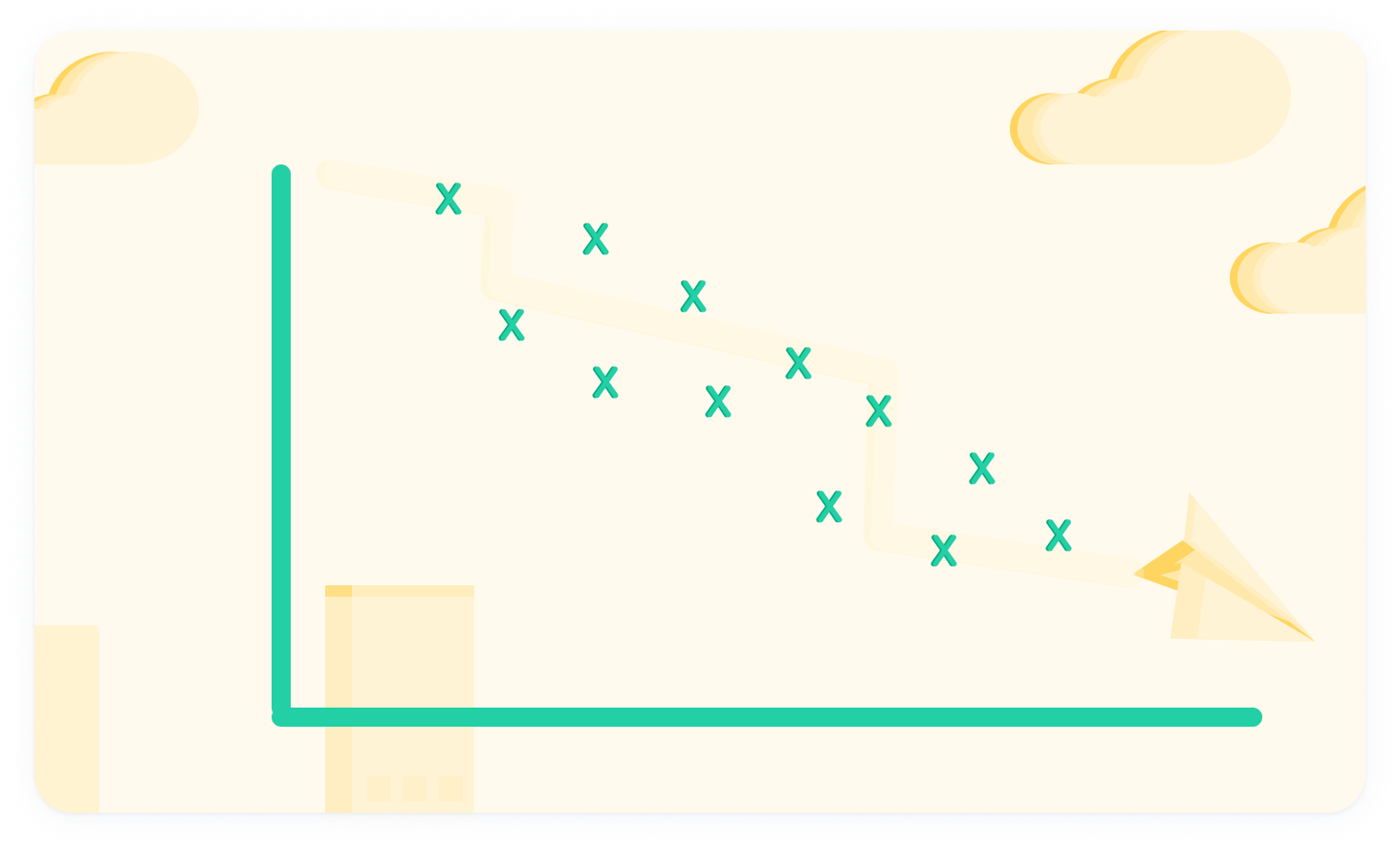
This is negative correlation
The opposite of positive correlation. As one variable decreases, the other variable also decreases.
There is no correlation here
There is no identifiable pattern which relates the points together.